LGR4GM Posted August 15, 2019 Report Posted August 15, 2019 On 9/15/2015 at 1:10 PM, sabills said: I'm telling you, 5 years. That'll be the 50th Anniversary and this team will, theoretically, be coming into its prime; perfect time for a full redesign and go back to the royals. 1 1 1 Quote
sabills Posted August 15, 2019 Report Posted August 15, 2019 42 minutes ago, LGR4GM said: well. I was at least 50% right there. Quote
Thorner Posted August 15, 2019 Report Posted August 15, 2019 (edited) 2 hours ago, CallawaySabres said: Even though I knew that was the case, I am glad that they finally announced it. It's just as well that 2020 is the year because they should hopefully be a playoff team by then. In the meantime, only ONE more year of crappy hockey and piss stained jerseys - whoohoo! You may have that chance because it was supposed to be this year...but probably next that they run through all of the jerseys and wind up on the royal. This is still happening next year? I feel like they would have hinted at that along with the Royal announcement today, but who knows. I kinda hope that doesn't happen at this point, or we are waiting another 2 full seasons before we actually get the Royal full time. Edit: Also, everyone seems to be taking the announcement today to mean we are getting Royal for the start of the next season, if it turns out it's not until closer to the end, they are gonna risk annoying people now haha Edited August 15, 2019 by Thorny Quote
CallawaySabres Posted April 30, 2020 Author Report Posted April 30, 2020 wake me up when there's a leak.... Quote
ubkev Posted May 14, 2020 Report Posted May 14, 2020 Right now Kerry and Tim are looking at the new Rams jerseys and they're thinking "that's f'n perfect!!!" Quote
Eleven Posted May 14, 2020 Report Posted May 14, 2020 13 minutes ago, ubkev said: Right now Kerry and Tim are looking at the new Rams jerseys and they're thinking "that's f'n perfect!!!" Hold up there; the slug was a Quinn product. Quote
Kruppstahl Posted May 14, 2020 Report Posted May 14, 2020 On 9/15/2015 at 1:10 PM, sabills said: I'm telling you, 5 years. That'll be the 50th Anniversary and this team will, theoretically, be coming into its prime; perfect time for a full redesign and go back to the royals. Saw this post and then realized the thread was 5 years old! LOL. Hmmm. That 5 year plan didn't play out as hoped for. Quote
sabills Posted May 14, 2020 Report Posted May 14, 2020 12 hours ago, Kruppstahl said: Saw this post and then realized the thread was 5 years old! LOL. Hmmm. That 5 year plan didn't play out as hoped for. lol but I did get the uniform call right! Quote
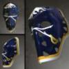
dudacek Posted June 25, 2020 Report Posted June 25, 2020 Is this the first physical sign of the return to royal blue? https://www.nhl.com/sabres/news/ullmark-shows-off-new-pads-featuring-royal-blue-color-scheme-buffalo-sabres/c-317238134 1 Quote
Taro T Posted June 25, 2020 Report Posted June 25, 2020 2 minutes ago, dudacek said: Is this the first physical sign of the return to royal blue? https://www.nhl.com/sabres/news/ullmark-shows-off-new-pads-featuring-royal-blue-color-scheme-buffalo-sabres/c-317238134 It seems to be. Wonder when the actual unis will start leaking out into public. Quote
LGR4GM Posted June 25, 2020 Report Posted June 25, 2020 8 minutes ago, Taro T said: It seems to be. Wonder when the actual unis will start leaking out into public. Not until March because they won't be ready by the start of the season because they will have forgotten to order them. 1 Quote
dudacek Posted June 25, 2020 Report Posted June 25, 2020 I’m one of the few the favours navy to royal, but those pads look absolutely fantastic. Quote
Randall Flagg Posted June 25, 2020 Report Posted June 25, 2020 For whatever reason, those pads look closer to our navy and off yellow than our royal blue to me. I have a friend who works with whoever distributes the sabres jerseys and has seen the royals and says they look great fwiw 1 1 Quote
shrader Posted June 25, 2020 Report Posted June 25, 2020 1 minute ago, Randall Flagg said: For whatever reason, those pads look closer to our navy and off yellow than our royal blue to me. I have a friend who works with whoever distributes the sabres jerseys and has seen the royals and says they look great fwiw Either your monitor is off or the shadows are throwing you. I suppose it might not necessarily be royal blue, but they're definitely much brighter than what the team has been wearing. Quote
LGR4GM Posted June 25, 2020 Report Posted June 25, 2020 If they were smart and wanted some much needed good press, they would release the jersey early since the already exist. Quote
Stoner Posted June 25, 2020 Report Posted June 25, 2020 40 minutes ago, dudacek said: I’m one of the few the favours navy to royal, but those pads look absolutely fantastic. The blue looks fine in person (at least on authentic sweaters in Sabres Store lighting), but it doesn't look as good on TV. Except... I forget which arena it was, but the lighting was such that the blue looked fantastic. That said, no problem here with a brighter blue to come. Quote
shrader Posted June 25, 2020 Report Posted June 25, 2020 2 minutes ago, LGR4GM said: If they were smart and wanted some much needed good press, they would release the jersey early since the already exist. It'll be draft day. There's really no point in pushing for a positive story right now because any positive reaction will have long since worn out by the time the team is playing again. 1 Quote
WildCard Posted June 25, 2020 Report Posted June 25, 2020 7 minutes ago, Randall Flagg said: For whatever reason, those pads look closer to our navy and off yellow than our royal blue to me. I have a friend who works with whoever distributes the sabres jerseys and has seen the royals and says they look great fwiw 4 minutes ago, shrader said: Either your monitor is off or the shadows are throwing you. I suppose it might not necessarily be royal blue, but they're definitely much brighter than what the team has been wearing. I thought the same as Flagg. I just chalked it up to goalies being crazy Quote
Randall Flagg Posted June 25, 2020 Report Posted June 25, 2020 5 minutes ago, shrader said: Either your monitor is off or the shadows are throwing you. I suppose it might not necessarily be royal blue, but they're definitely much brighter than what the team has been wearing. This would be just one of many instances where my ability to discern color seems to be worse and different than anyone else's. It genuinely looks navy to me, just a hair brighter. I'm happy to admit that it is wrong but I'm trying hard and cannot see even a hint of the blue I've been pining for Quote
dudacek Posted June 25, 2020 Report Posted June 25, 2020 Does anyone know if they are the exact same unis Perreault and Martin wore? Or are they the current jerseys in royal, or some other variation in the original colours? Quote
Stoner Posted June 25, 2020 Report Posted June 25, 2020 18 minutes ago, Randall Flagg said: This would be just one of many instances where my ability to discern color seems to be worse and different than anyone else's. It genuinely looks navy to me, just a hair brighter. I'm happy to admit that it is wrong but I'm trying hard and cannot see even a hint of the blue I've been pining for Same here, but I'm going to blame the lighting. There's no way the Sabres aren't going to give the fans exactly what they've been screaming for en masse. 6 minutes ago, dudacek said: Does anyone know if they are the exact same unis Perreault and Martin wore? Or are they the current jerseys in royal, or some other variation in the original colours? I THINK if you laid out the uniforms they wore for the first 10 years, you'd see different shades of blue. I KNOW the logo was slightly different from year to year, especially in the early days. Things were pretty loosey goosey in the 70s and I don't think anyone cared. Quote
Taro T Posted June 25, 2020 Report Posted June 25, 2020 15 minutes ago, PASabreFan said: Same here, but I'm going to blame the lighting. There's no way the Sabres aren't going to give the fans exactly what they've been screaming for en masse. I THINK if you laid out the uniforms they wore for the first 10 years, you'd see different shades of blue. I KNOW the logo was slightly different from year to year, especially in the early days. Things were pretty loosey goosey in the 70s and I don't think anyone cared. The shading definitely was slightly different y-t-y. But the randomness to the stitching of the logo on the sweater didn't start to happen until ~1980. It was really bad in the early '80's with some of the logos seeming to be shaped more closely to the Denver Broncos old Rorschach test logo than the classic white charging Buffalo that was there in '70. Quote
dudacek Posted June 25, 2020 Report Posted June 25, 2020 (edited) 20 minutes ago, PASabreFan said: Same here, but I'm going to blame the lighting. There's no way the Sabres aren't going to give the fans exactly what they've been screaming for en masse. I THINK if you laid out the uniforms they wore for the first 10 years, you'd see different shades of blue. I KNOW the logo was slightly different from year to year, especially in the early days. Things were pretty loosey goosey in the 70s and I don't think anyone cared. For sure, but I think they also had the same numbers of stripes and the same yoke in the same basic colours in the same places. Just wondering if it’s going to be “the same” like the Bruins, or THE SAME like the Red Wings. Edited June 25, 2020 by dudacek Quote
Stoner Posted June 25, 2020 Report Posted June 25, 2020 1 minute ago, Taro T said: The shading definitely was slightly different y-t-y. But the randomness to the stitching of the logo on the sweater didn't start to happen until ~1980. It was really bad in the early '80's with some of the logos seeming to be shaped more closely to the Denver Broncos old Rorschach test logo than the classic white charging Buffalo that was there in '70. We might be talking about different things. I'll try to find the images I saw of the logo. I'm pretty sure it was well before 1980. Quote
Taro T Posted June 25, 2020 Report Posted June 25, 2020 1 minute ago, PASabreFan said: We might be talking about different things. I'll try to find the images I saw of the logo. I'm pretty sure it was well before 1980. Take a look at photos of Housley from early in his career. The buffalo on the sweater has such a huge crown it is barely recognizable. And then look at any Perreault sweater from the early days. They cheaped out on the logo around '80. Quote
Recommended Posts
Join the conversation
You can post now and register later. If you have an account, sign in now to post with your account.