IKnowPhysics
-
Posts
7,301 -
Joined
-
Last visited
Content Type
Profiles
Forums
Events
Everything posted by IKnowPhysics
-

How many Norris Trophies will Dahlin win?
IKnowPhysics replied to Crusader1969's topic in The Aud Club
-
GDT: Sabres @ Redwings, 11/30/2022, 7pm, TNT 📺, wgr 📻
IKnowPhysics replied to LGR4GM's topic in The Aud Club
-
Jack Quinn is on the verge of something awesome
IKnowPhysics replied to LGR4GM's topic in The Aud Club
Quinn's shootout goal over Nedeljkovic is worthy of an SVU investigation. -
GDT: Sabres @ Redwings, 11/30/2022, 7pm, TNT 📺, wgr 📻
IKnowPhysics replied to LGR4GM's topic in The Aud Club
Rage Thompson: -
GDT: Sabres @ Redwings, 11/30/2022, 7pm, TNT 📺, wgr 📻
IKnowPhysics replied to LGR4GM's topic in The Aud Club
Sabres played well against Tampa and they're angry they lost. Red Wings: -
Petersen is playing at an Eric Comrie level but is making 278% more until 2025. Stay away. Not even sure I would do this.
-
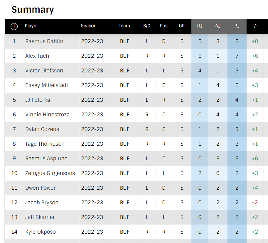
Mittelstadt, Olofsson and the 3rd and 4th Lines
IKnowPhysics replied to nfreeman's topic in The Aud Club
Mittelstadt's stats 5v5 are quite bad, but, like it or not, he's been one of the best Sabres on the powerplay, helping make it 7th in the league. -
-
Also obligatory:
-
At first glance, I was absolutely: But now looking at it for a few minutes and finding other images other than the video, I'm starting to back off that opinion. I'm starting to sort of like, but it's not everything it could be. Maybe the full kit will look sharp. But if you don't like this jersey, depending on your reason why, be warned you may not like the black thirds coming... Bad: The yellow sleeve ends are bleh. It may be the lighting in the video, but they look dingy. [The image below straightens this out; it was the lighting in the video.] If you go with a mostly white jersey, especially all-white yoke with no shoulder patches, you do it to for a clean look (see 50th anniversary jerseys). The sleeves ruin the clean look. So they didn't want to go this route. So if not going for clean... why no shoulder patches? Cost savings? The point of the stripe on the under side of the arms on the original jerseys was to make the jersey body fabric look like a buffalo head shape. A different color stripe ruins this effect and becomes pointless. [The OG blacks suffered from this.] So it's clear the route they chose was to do a blue/gold color inversion of the OG black jerseys (not the whites, because there's no yoke). Similarly, the side-body chevron don't extend to the front and rear enough at the bottom of the jersey to help form the chin of the buffalo head shape. Nor does it extend up to the armpit. So the hidden buffalo head shape is gone. This may have been forced by the oversized crest or by trying to be cheap on manufacturing more complex fabric shapes. The bigger problem is I'm betting Adidas does the same thing for our black thirds. I bet Adidas has tooled their fabric cutting and sewing for the thirds and used it for this jersey. This doesn't affect fabric color, but affects what fabric shapes are stitched together. You can see the extra seam in the gold sleeve fabric for where the gray is going to go at the end of the sleeve on the black thirds. You can see the extra seam in the gold fabric on the body sides for where the gray will go on the black thirds. You can see that the yoke fabric doesn't come down over the shoulder with curved edges like the old CCM jerseys, meaning that you don't get a curved top part of a horn shape on the sleeve. This doesn't evoke much nostalgia in me. This is now the worst jersey to incorporate the Buffalo head crest on the chest, but it's not super-bad. Good: They tried and seemingly listened to fan response from last year. No gray with the blue/gold. Oversized crest is boss. I appreciate the OG font- the nameplates and rear numbers are going to look good. They didn't perfect the clean look, but at least they didn't put numbers on the front to make it more busy. It's a relatively simple jersey, which works in its favor. Again, depending on the full kit, this could look pretty sharp. Using yellow as the outside border of the crest is risky, but for a "fun" jersey, it does pop. I haven't looked at the other reverse retros for this year yet, but I'm betting this is far from the worst. This could be considered the white counter part to the black thirds coming, except with blue and gold. Gives Buffalo a few different looks to play in. This is not in the bottom rankings of Buffalo jerseys all-time. NHL posted a better image: For comparison, the OG: Looking the other Reverse Retro jerseys for this year, and holy hell did we luck out. https://theathletic.com/3711004/2022/10/20/nhl-reverse-retro-jerseys-2022-rankings/
-
Normally this time of year, Sabres would play LA, ANA, SJS, then maybe PHX in that order. That trip is February this year.
-
What is this, a crossover episode?


-
Season back on. Tank over.
-
Season over. Time for tank.
-
Oh man, the digital ads don't appear for the low-angle cameras, so when they switch to the regular angle BAM DIFFERENT BOARDS. This ***** suuucccks.
-
Yo these ice mics are crisp tonight.
-
Lots. Accidentally cutting off the tribute video for an NHL.com App and a Bosch tool commercial was not a good look. LOL You little pipsqueak shut the ***** up!
-
Much-needed for player development and incremental team improvement. Also sets the right coach-is-here-to-stay culture, which becomes embodied in the players' commitment and discipline. One major complaint from players through the stalled rebuilds included the high turnover rate of the coaching staff, which impacted their developmental trajectory.
-
RJ to Have Broadcast Emeritus Role with the Sabres
IKnowPhysics replied to Brawndo's topic in The Aud Club
Nice. RJ should be enabled and encouraged to do whatever he wants. Even if he just wanders around in the background of the intermission report with suspenders on, it'd make the broadcast better. -
Briefer scouting report: Ottawa sucks.
-
That is his upbringing as a Sabres fan talking, 100%. Not even other TOR rivals, like MTL or OTT fans, would lay that on Leafs radio.
-
Multiple Goat Heads For Jerseys in 2022-23 Season?
IKnowPhysics replied to Brawndo's topic in The Aud Club
For reference: -
Multiple Goat Heads For Jerseys in 2022-23 Season?
IKnowPhysics replied to Brawndo's topic in The Aud Club
Now make it hairy.