
SDS
-
Posts
263 -
Joined
-
Last visited
Content Type
Profiles
Forums
Events
Everything posted by SDS
-

Puck Daddy says GMTM's desire for Luke Richardson as coach
SDS replied to SDS's topic in The Aud Club
Good find... -
Probably because they remove a color in the printing process.
-
and the sell-off has just started. More to come...
-
Puck Daddy says GMTM's desire for Luke Richardson as coach
SDS replied to SDS's topic in The Aud Club
Some snippets from Wikipedia: "Luke Richardson was selected 7th overall by the Toronto Maple Leafs in the 1987 NHL Entry Draft after two successful seasons with the Peterborough Petes of the OHL. Midway through his rookie NHL season, on January 6, 1988, Richardson was the victim of an infamous attack from Dino Ciccarelli of the Minnesota North Stars, who clubbed him over the head several times with his stick. Ciccarelli was later convicted of assault, serving one day in jail and paying a fine of $1000 (Canadian). However, the assault had no discernible effects on the play of Richardson. He remained a regular on the Toronto blueline until 1991 when he was involved in a blockbuster trade, moving to the Edmonton Oilers along with Vincent Damphousse, Scott Thornton, Peter Ing, future considerations, and cash in exchange for Grant Fuhr, Glenn Anderson and Craig Berube." "During his rookie season as head coach, Richardson led an inexperienced Binghamton team to a 44-24-1-7 record, finishing fourth in the AHL's Eastern Conference.[4] He was named coach of the AHL Eastern Conference all-star team in 2012-13 after guiding the Senators to the conference's best record at the all-star break.[4] The Senators' organization subsequently rewarded Richardson with a contract extension through the 2014-15 season.[4]" "On September 27, 2008, Richardson re-signed with Ottawa to a one year, two-way contract. During the 2008–09 season, and being used primarily as a reserve defenceman, Richardson announced his retirement as a player on November 27, 2008, having played in just two games that season, with the intentions of pursuing a coaching career.[3] He was hired as an assistant coach by the Senators later that season. After three seasons as an assistant coach in Ottawa, Richardson joined the Binghamton Senators, Ottawa's top minor league affiliate, as head coach." "On November 13, 2010, his daughter Daron committed suicide at the Richardson family home in Ottawa, Ontario. On November 18, 2010, 5,600 mourners attended a celebration of life ceremony for Daron at Scotiabank Place.[5] Of note, the Philadelphia Flyers (one of Luke Richardson's former teams) held a moment of silence for Daron before their game against the Senators on November 15.[6]" "During the 2011–12 Canada women's national ice hockey team season, his daughter Morgan was a member of the Canadian National Under 18 team that participated in a three game series vs. the USA in August 2011.[8]" -
Puck Daddy says GMTM's desire for Luke Richardson as coach
SDS replied to SDS's topic in The Aud Club
So then, what would be your thoughts on Luke Richardson? -
The reason for that is because you can't see the future. Two days ago we were a different team. At any point in the future, we will become a different team again. This is a roster in tremendous flux - to say you can't see X three years out is obvious because no one has a clue what this team will be. No one said we are a lock for last, but we are hoping for the best.
-
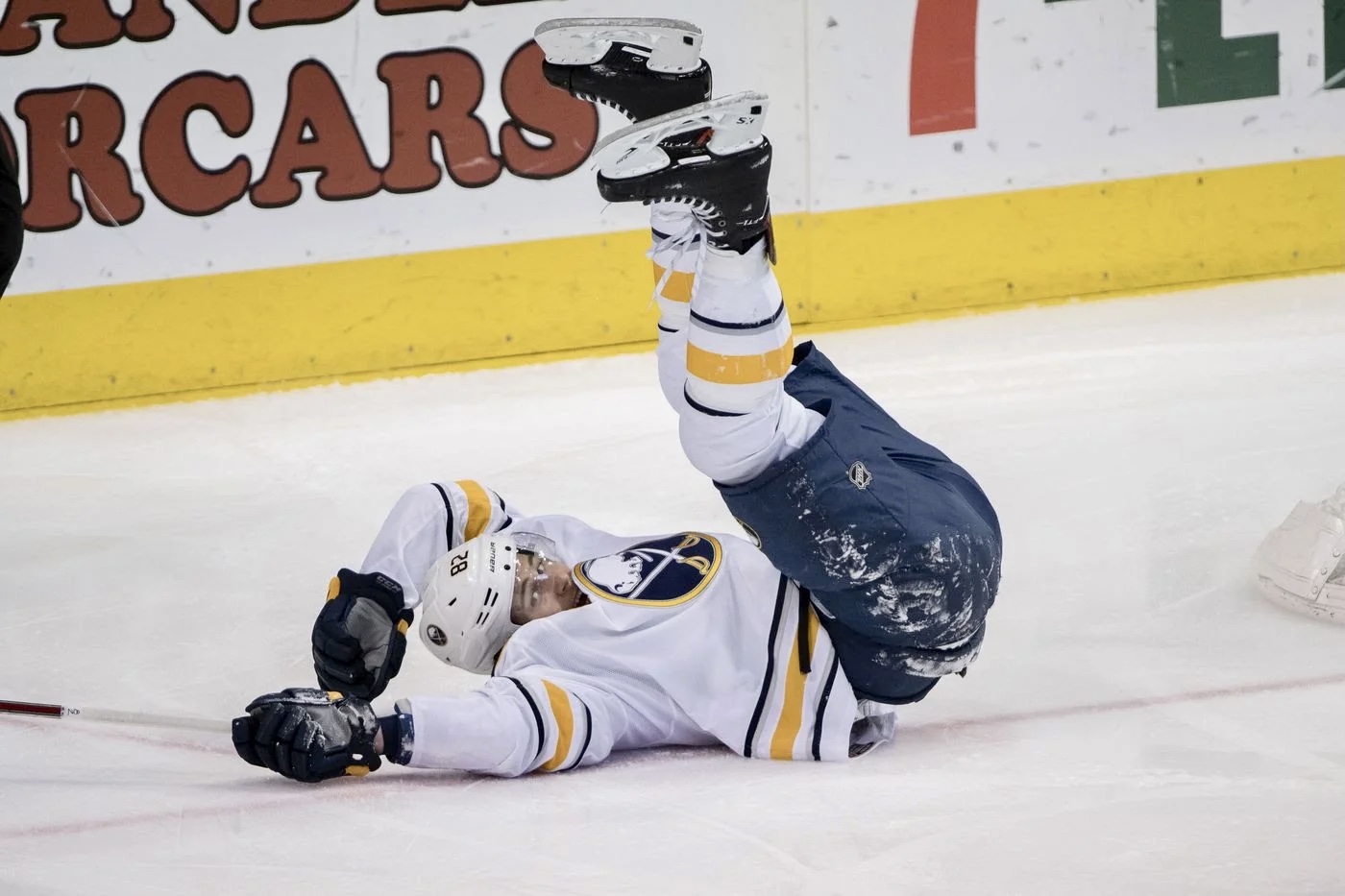
is the worst kept secret in hockey. http://sports.yahoo.com/blogs/nhl-puck-daddy/evander-kane-trade-analysis--sabres-follow-la-kings-template--tad-prematurely-211145014.html I know this was briefly suggested in another thread, but this is something that deserves its own space.
-
Yikes! I have no idea. I was going to type ambassador, but then changed it. I don't know what was there before it autocorrected.
-
I don't recall any. I remember him as being pretty well liked and supported. If his time here was incident free, I wonder if having him reach out to Kane as a team ambassador to share his experience might help with any issues Kane faced in Winnipeg?
-
All-time Sabres center ice logos and red line designs
SDS replied to PASabreFan's topic in The Aud Club
I'm very uncomfortable with a red line having a "PMS" color code. -
Who is the last player that we had that excels in so many areas of the game as Kane?
-
I'm guessing you haven't been following the Sabres' plan this season.
-
Wonder if that was just an omission?
-
Although I don't know enough about all the pieces, I'll throw my hat into the "hate to see Lemieux go" camp.
-
As for the old logo - the buffalo will always be going backward in a Western society. We read from left to right. That buffalo is looking right to left. That was a screw up in the original design. The gray is out of place. No need for 5 colors in any branding like an NHL team.
-
What football team do you watch? :unsure:
-
With complicated software, everyone should just pretend they are a teenager and just play with the buttons until something good happens.
-
There is a new skin I am looking at (you can see it you change themes). It may make it easier to actually develop separate B/G and B/R skins.
-
If you want a crack at playing around with it - I can create a test installation and give you access to modifying the skin directly.
-
I don't think this is true anymore. I just recently read that entire words can now be treated as single entities, i. e. letters. So, a 30 character string of five dictionary words is equivalent to a five letter string.
-
I wouldn't doubt that player names and numbers are in their databases. I think all we are left with now are programs like 1password to manage the important ones for us.
-
They just didn't catch on in Canada like in the US.
-
how about this one? https://www.google.com/fonts#ChoosePlace:select/Collection:Open+Sans:400,700,600
-
does the font look bad here: https://www.google.com/fonts/specimen/Open+Sans I see lots of reports on font rendering issues with certains browsers and versions. What are the FF and Chrome versions you are using?
-
Using chrome perhaps?